Where and how to start a website redesign project?

Majority of clients I have had the chance to be working with do not know the right process and where to start off when redesigning an existing website and that is totally normal. Since website redesign process is usually performed once in a couple of years even those who have done it have hard time remembering the right process.
I know it is tempting to jump right away into design process but that is something only a tiny fraction of us can afford to do. Take a moment and see if you can answer these questions:
- Is the website aligned with business goals?
- Who is the target audience?
- Who are the visitors and where do they arrive from?
- What are the users looking for, how long do they spend on the project? Are they easily able to find what they are looking for?
- Where and why the users are dropping off (leaving the website)?
- What is the most and least popular content? Are there any changes or improvements necessary?
- What are people most interested in depending from region and season?
- Is the navigation easy to use and understand? Should it be improved upon or better left untouched?
- How good is the UX (user experience) and CX (customer experience)?
- Should the search functionality be added, removed or kept?
- What kind of devices are used (mobile, tablet or desktop)?
These are just some of the questions in order to give you an idea of the information that is needed. If you can answer all of the above questions – you actually might be ready to get those hands dirty with the actual design of your website redesign process. Otherwise you should better think twice and do the homework :). A research and analysis process is a must-have phase of each and every digital project.
I have outlined the steps that should be taken beforehand the website redesign process.
Setting goals
Somebody once said that people with goals succeed because they know where they are going. That is so true therefore if you embark on website redesign, you must have clear goals in mind what is it you want to achieve and what should the final results be like. Here are a couple of examples of what could your goals look like:
- Decrease average bounce rate by 50%
- Increase the average time spent on website by 1 minute
- Increase e-mail signup by 20%
- Increase product sales by at least 30%
- Decrease the amount of abandoned carts during the checkout process
Once you have set your goals you are able to move on to the next part and get into data phase.
Data analysis
Data analysis is the Holy Grail of any type of website design or redesign process. As we have learned from Cambridge Analytica – the most valuable thing you can have is clear data. Without data, companies are blind and deaf, wandering out onto the web like deer on a freeway. So data is the basis upon we can build in order to achieve our goals that we have set.
So where do we get data from in order to analyze it and later create user flows, user friendly and intuitive structure and much more:
Analyze data from your Google Analytics
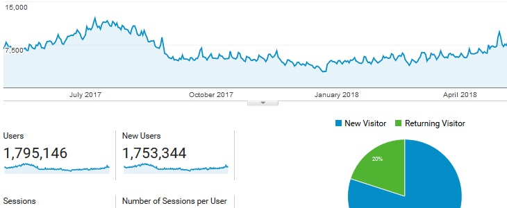
This is probably is one of the best tool that can help you understand what and how users are interacting with your current web project. You can see everything starting from user genders and locations to which pages are they landing on and how long are they spending there. It is a very powerful tool that can give you a ton of information. This data can be the basis of user-flows that you can later build upon. If you don’t have it installed on your website you better do it right away, I am serious, you can thank me later :)
Data from heatmaps, scrollmaps
Then there is another kind of data that we can scrape from our project and it is all kinds of heatmaps, scrollmaps etc. Data collected in these tools can give us information and answers to questions like:
- How users are viewing and reading our website?
- Do users understand the clickable areas / buttons?
- How far users scroll below the fold?
We might also find some new information about user behavior. For example we could find out that some website elements are being clicked though they are not clickable meaning that we are misleading users and should take appropriate measures to solve this issue.
Data from polls
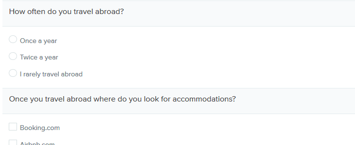
Asking questions might be one of the oldest method of collecting data and it works really well today. There are many ways how this can be accomplished. For example you could set up a poll on your website and ask visitors to take a couple of minutes of their time in order to answer some basic questions, you could also sit down with a couple of people, show them your project, let them test it out for a while and then ask them some relevant questions.
No matter what type of polls you are using never forget your goals and try to focus your questions around them so that later the answers received would help in achieving those goals.
Data from public sources
If you have used all of the above data gathering mechanisms and still are lacking some crucial information then you might want to look for publicly available data and statistics.
Concluding data analysis and creating user flows
Once you have analyzed all of the information you should know everything that you wanted to know and even have answers to questions you did not even consider asking at the beginning of the process and this is kind of awesome :). Now the next thing to do is put all of these answers to good use in creating user flows which will be very handy when you will be planning structure and building the prototype or wireframe.
I will not be getting in depth on creating user flows but here is an outstanding article about the process.
Navigation planning and Card sorting
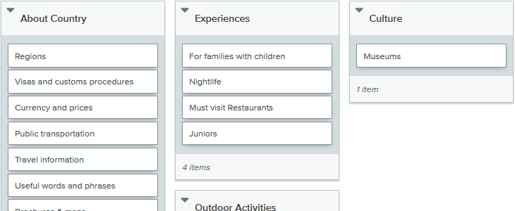
Ease of navigation is important in both physical and virtual space. Basing on our goals, previously gathered data and new information we might have to redesign website navigation as well even if we really don’t want to because of SEO ranking changes, possible broken links etc.
In order to plan and redesign your navigation you must have answers about these questions:
- What is the most popular content
- What are the visitors looking for
- How is the current navigation used
If you are creating a large website or an e-commerce shop with many products across multiple categories you should consider laying out your structure and creating a card sorting test that will allow you to have a better understanding of how your target audience sees your structure. You must take good care in this process because you want the navigation to be simple, easy and intuitive – for large websites a good navigation will make your new visitors feel like they know this place since childhood.
Once you have laid out your structure I would suggest to use usertesting.com who are offering these kind of tests in an easy to use and understand interface. If you are not so comfortable with digital solutions you can also hire a company that will create a face to face card sorting tests but those usually are a lot more expensive.
Prototyping and user testing (research)
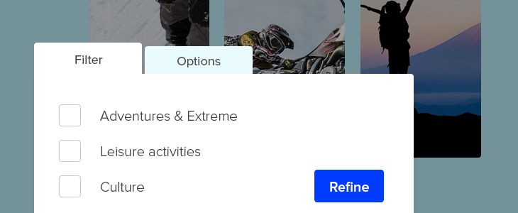
By now you should have a strong about your users, what are their goals, what are they interested in, how are they using your website and where you could improve your UX. You should be basing your new prototype on the previously set goals, analyzed information and created user flows that should show you real user scenarios that should be thought of once creating the prototype.
Your prototype should include all of the most crucial information so that all of the user flows would fit into it and align perfectly with them. This way you will be creating a project that will not only be easy to use and understand but also the customer experience will be smooth and very pleasant.
I would suggest to create the prototype using Invision application that allows to quickly create clickable mock-ups. It can be later integrated with Usertesting service which is able to provide users according to your target audience. The results are presented both in video recordings and qualitative data that should be used to make changes before moving on to the next and final step.
Finally – Design
Tadaaa, we have finally reached the stage of where we can actually start creating the new design. And, man, how powerful and confident reaching this point you will feel. I am serious, once you have all of the data and information on your hands, once you have answered all of those questions you had you will be so happy because you not just have a feeling or a hunch of what should be done, but you will know exactly what has to be done.
Sometimes even with all of the previous stages of preparation we can still have some blind spots left, but those can be tackled with further testing. For example you can setup A/B tests in order to test out which of the 2 (or more) solutions works best in your case and have your answers collected this way.
Either way if you had some unanswered questions left at this point or not, once the design is complete and ready to launch for the public, you would still have to continue to test it, collect information about the user behavior and interaction with your design and then get back to the design and tweak it for a better result.
As Neville Brody has once said – digital design is like painting, except the paint never dries. And it is so true because you must continuously repeat this design process since there is no such thing as a perfect design. Everything around us is changing starting from the climate to device usage therefore the perfect design is forever changing and we must follow with it if we want to be successful and efficient.




Your thoughts